
Establishing and maintaining quality control in life science manufacturing is of paramount importance because it can directly affect a patients’ health, quality of life, and even their life itself. The WHO defines quality control as “the sum of all procedures undertaken to ensure the identity and purity of a particular pharmaceutical.” Therefore, effective quality control procedures are absolutely essential in medical device manufacturing.
While quality control tools take different forms, one of the oldest and most indispensable is the X-bar chart. Used in conjunction with its partner, the R-chart, the X-bar chart offers quality control personnel a way to analyze defects or variations of a process from a grouping of samples.
This post takes a deep dive into quality control, quality control charts, and how using an X-bar chart can be a significant factor in achieving greater quality control of life science manufacturing.
What is quality control?
Quality control itself is the process through which a medical device or pharmaceutical manufacturer ensures that the product quality is maintained and adheres to a defined set of quality criteria or meets the requirements of the client or customer.
It is impossible to mention quality control without at least one sentence on quality assurance. While some may mix the two, quality assurance describes the confirmation that specific requirements are met, while quality control refers to the actual inspection, testing, and approval of the product or service. The purpose of quality control testing is to ensure that your product is safe and effective for use.
At each stage of the manufacturing process, strict quality control measures need to be in place. After the product has been manufactured, tests must be performed against preset acceptance criteria to ensure the completed product is compliant with all applicable quality and regulatory standards, as well as the manufacturer’s specifications.
Most life science manufacturers employ designated quality control personnel who are solely responsible for product testing and process validation. These individuals carry out real-time measurements and verification of parts, including raw materials from a supplier and the final products created through the manufacturing process. Designated quality control inspectors are also responsible for removing or discarding all products or equipment that deviate from or fail to meet specifications.
What is a quality control chart?
Well-defined controls help standardize and measure both production and reactions to quality issues. There are four methods of measuring the performance of quality control used in various industries and products:
- The Sigma Six is mainly used by business people who use statistics, financial analysis, and project management to improve business functionality.
- The Taguchi Method emphasizes research and development, product design, and product development to reduce the occurrence of defects and failures in products.
- The 100% Inspection Method involves looking at and assessing all parts of a product. This method is most often used to evaluate valuable metals and produce.
- The Quality Control Chart is a graph that shows whether or not sampled items or processes fulfill their specified standards, and if not, how far they deviate from them.
Engineers frequently use quality control charts to evaluate the performance of a company’s operations or completed products. If issues are found, they can be quickly compared to their location on the chart for debugging and error management. To put it another way, a chart establishes a practical, well-defined framework for sustaining quality control. The precision and timeliness of quality control charts make them most suitable for medical device manufacturers seeking a measurement for quality control.
What is an X-bar chart?
An X-bar chart is a frequently used type of quality control chart, where the y-axis tracks the degree to which the deviation of the tested attribute is acceptable.
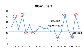
The X-bar chart is used to monitor the mean of successive samples of constant size (n).
The x-axis on the X-bar chart tracks the samples tested. Analyzing the pattern of variance depicted by a quality control chart can help determine if defects are occurring randomly or systematically.
This type of control chart is used for characteristics that can be measured on a continuous scale, such as weight, temperature, thickness, etc. For example, one might take seven samples of a particular device component from production every hour, measure the width of each, and then plot the average of the seven width values on the chart for each sample.
Now, while the X-bar chart is essential since it helps to monitor the average or the mean of the process and how this changes over time, it is never used alone and is most often used in combination with the R-chart.
What is an R-Chart?
An R-Chart is a statistical quality assurance graph for determining the stability and predictability of a process. The R-chart shows the error of measurement, since the R values are the differences between successive measurements of the same product. In other words, the R-chart shows the sample range (which represents the difference between the highest and lowest value in each sample) and monitors process variability at regular intervals from a process.
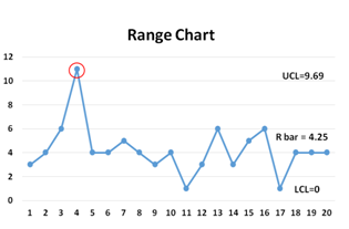
While the X-bar shows the overall mean or process mean, the R-chart shows the range of the statistical center line.
Together, X-bar and R-charts are quality control charts used in conjunction to keep track of the mean and variation of a process using samples gathered over a period of time. Both charts’ control limits are used to monitor the mean and variation of the process going forward.
Why should you use an X-bar chart?
X-bar charts have many uses in the quality control process and for process stability. Once the data from the X-bar chart has been analyzed, the information extrapolated can be used to:
- Standardize manufacturing processes
- Determine if there are improvement opportunities, or prevent unnecessary changes
- Measure and assess the performance of equipment
Additionally, improvement can be facilitated by comparing current data results to historical performance.
It’s crucial to note that these charts display control limits. By paying attention to any points outside the control limits and understanding that they indicate out-of-control processes, manufacturers can use these points to locate the origins of the process variables.
There are advantages and disadvantages to using X-bar quality control charts. These factors should be carefully weighed by medical device and pharmaceutical manufacturers.
Advantages:
- Easy to read, analyze, understand, and optimize the process
- Widely used; operates on ideas that can be applied to more complicated control charts
- Can be used to identify statistically unusual patterns, separate variation in averages from variation in standard deviation
- Results in higher quality services, reduced costs, and higher profitability
Disadvantages:
- Each trait must have its own chart
- Regardless of sample size, just two values per subgroup are used to estimate the range’s standard deviation
- For sample sizes bigger than nine, it cannot be utilized to correctly identify process variability
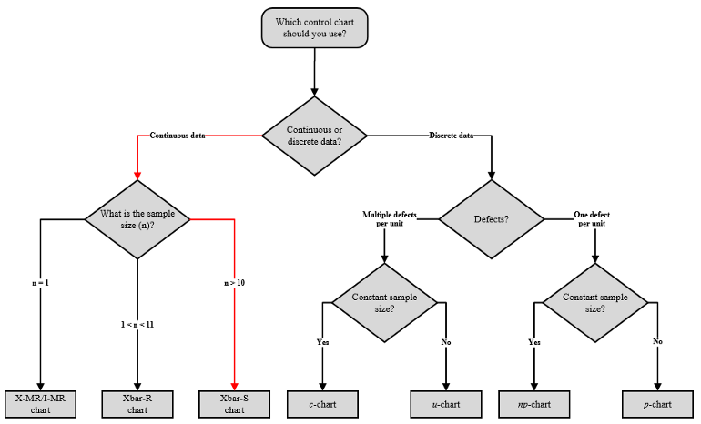
When to Use an X-bar Chart
As we have seen, the X-bar chart indicates long-term variation in a process. Here are five guidelines for correctly employing an X-bar chart for quality control:
- When you only have one data element to illustrate a situation, you can use these charts. For each sample obtained, you can plot an element on the chart. This enables you to determine whether your procedure is statistically controlled for each sample taken.
- They can be used to control, analyze, and enhance a process in a manufacturing context. Variations in production caused by material, machinery, time, and other factors can be adjusted, and regular output can be resumed.
- While it is impossible to subgroup data pieces due to their low frequency, the control chart can be used to examine findings. If your processes are in statistical control, the average on the chart is your population average, used to calculate the population standard deviation. Furthermore, since the processes are in statistical control, you can predict how the processes will perform in the future.
- The goal of plotting the control chart is identifying any variations in the process. The operator would quickly adjust if the data elements exceeded the control limits.
- The graph can be used to spot statistically unusual trends and determine when action should be taken.
How do you create and interpret an X-bar chart?
Creating an X-bar chart (and/or an R-chart) requires significant data and the use of mathematical formulas. Here are the steps and formulas necessary to create them, and tips on how to interpret the final charts (referenced from Accendo Reliability).
1. Determine Sample Plan
Determine the sample size (n) and the frequency of sampling. Consider the cost of sampling, required resources, and balance with minimizing time (and produced units) between measurements. More samples and more frequent measurements are better statistically.
2. Collect the initial set of samples
It has been recommended to process 100 individual units in 25 samples of 4 each as you need enough samples to create reasonable estimates of the mean values of X̅ and s. Keep the data in time sequence following the time of the sample selection, which should be in the same order of manufacture.
3. Calculate X̅
Calculate the average for each set of samples. This is the X̅ for each sample.
4. Calculate R
Calculate the range of each set of samples. This is the difference between the largest and the smallest value in the sample.
5. Calculate x̄̄
Calculate the average of the X̅s. This is the centerline of the X̅ control chart.
6. Calculate R
Calculate the average of the R values. This is the centerline of the R control chart.
7. Calculate control limits
First, calculate the R-chart limits.
UCLR=RD4R
LCLR=D3R
Note: the lower limit is zero for a sample size (n) of less than seven.
The D3 and D4 constants are found in tables or calculated with the following formulas:
D3 = 1-3d3d2
D4=1+3d3d2
where,

and,
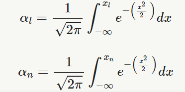
αn=1√2π∫xn−∞e−(x22 )dx
n = sample size
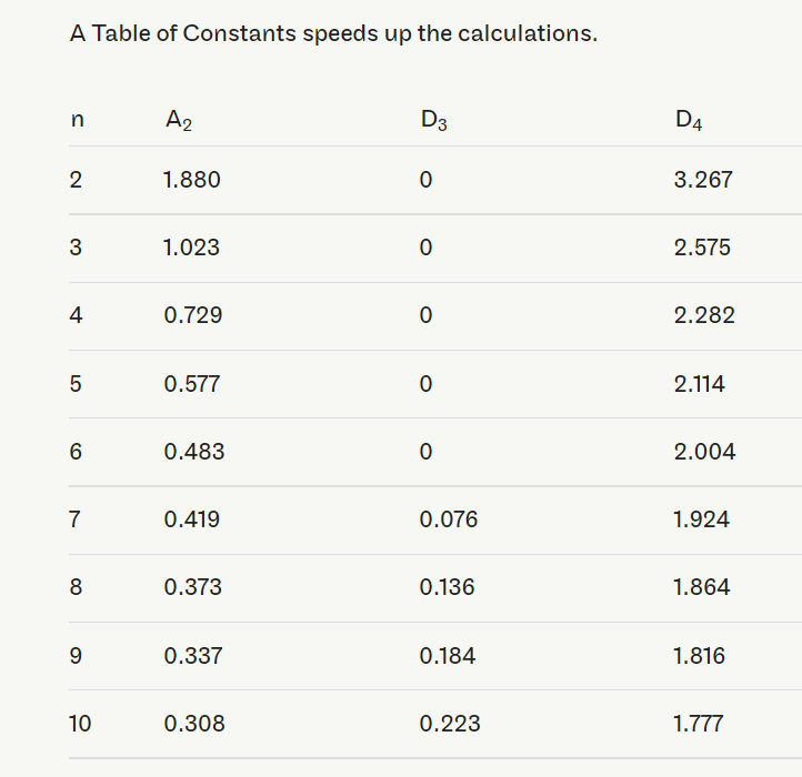
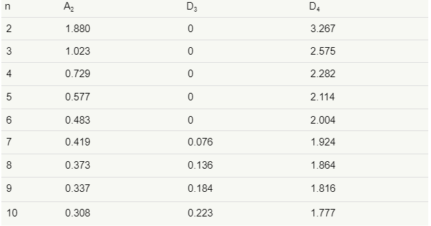
Be sure to plot the data on the R-chart and, if not in control, work to bring the variability of the process under control before continuing with building the control chart.
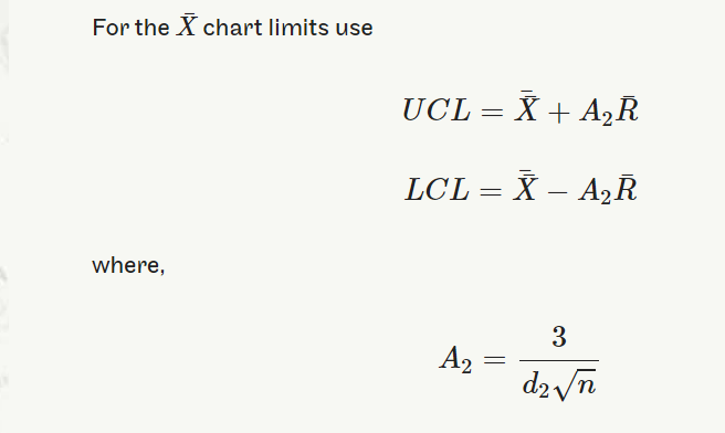
UCL=¯¯X+A2¯RUCL=X¯¯+A2R¯
LCL=¯¯X−A2¯RLCL=X¯¯−A2R¯
where A2=3d2√n
8. Plot the data
With the control limits in place, gather samples and plot the data. Look for special or assignable causes and adjust the process where applicable to maintain a stable and in-control process.
9. How to interpret the resulting X-bar and R charts
Before interpreting the X-bar chart, consult the R-chart to see whether the process variation is in control. If the R-chart is not in control, then the control limits on the X-bar chart are not accurate. Here’s how to properly interpret the charts, based on findings from Quality America Inc.:
Interpreting the R-chart
- If any points are outside the designated control limits, you need to run test violations. If there are any, special causes need to be eliminated.
- Remove the statistical bias caused by “out of the control” points by dropping them from the calculations of the average range, range control limits, average X-bar and X-bar control limits.
- There should be more than five distinct values plotted on the range chart, and no one value should appear more than 25% of the time.
- If values are repeated too often, then you have an inadequate resolution of your measurements. This will adversely affect your control limit calculations.
- Once the effect of the out-of-control points have been removed from the R-chart, look at the X-bar Chart.
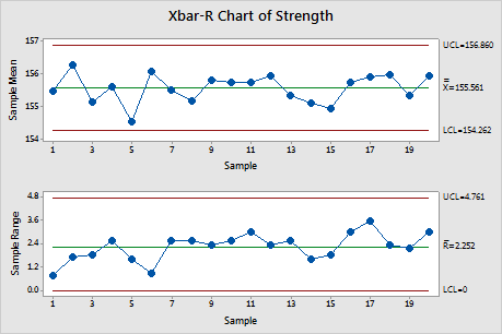
Interpreting the X-bar Chart
- Interpret the points on the X-bar chart relative to the control limits and Run Test rules.
- Never consider the points on the X-bar chart relative to specifications, since the observations from the process vary much more than the subgroup averages.
- If there are out-of-control points on the X-bar Chart, then the special causes must be eliminated. Brainstorm and conduct Designed Experiments to find those process elements that contribute to sporadic changes in process location.
- Remove the statistical bias of the out-of-control points by dropping them from the calculations of the average X-bar and X-bar control limits.
- Process capability is only meaningful when the process is stable since we cannot predict the outcome of an unstable process.
Tips for Getting the Most from an X-bar Chart
After creating the chart, it is important to keep in mind how to get the highest amount of useful information possible. Here are five tips on getting the most from using an x-bar chart for quality control:
- Before determining control limits, collect as many subgroups as feasible. With lower amounts of data, the X-bar and R-chart may not accurately portray the system’s variability. The greater the number of subgroups employed in control limit calculations, the more reliable the analysis becomes. Control limit calculations usually involve twenty to twenty-five subgroups.
- X-bar and R-charts have several applications. When you begin improving a system, use them to assess its stability.
- After assessing stability, determine if the data needs to be stratified. It is possible to find different results among workers, among different machines, etc. To see if these factors cause variability on the X-bar and R-charts, collect and enter data to allow for the data to be stratified by time, location, symptom, and operator.
- X-bar and R-charts can be used to analyze the results of process improvements. Here, you would consider how the process is running and compare it to how it ran in the past. Do process changes produce the desired improvement?
- Use X-bar and R charts for standardization. This is best accomplished by continuously collecting and analyzing data throughout the process operation. Without a control chart, there is no way to know if the process has changed or identify process variability sources.
X-bar Charts and QMS
The importance of quality control in medical device manufacturing cannot be overestimated. As we have seen, X-bar charts are a uniquely suitable component of the methodology for establishing and maintaining quality control across all life science manufacturing.
However, in an industry where any error or lack can have direct life or death consequences, precision in every aspect of manufacture is imperative. A comprehensive quality management system (QMS) is of equal importance to quality control systems.
To ensure the highest level of quality control many companies are turning to electronic QMS (eQMS) like Dot Compliance. With one cloud-connected eQMS, manufacturers can oversee quality management, regulatory compliance, suppliers, contracted manufacturers, internal production, and distribution chains. An automated system allows for creating all necessary charts (including X-bar charts), providing complete oversight over the entire manufacturing process.
Utilizing QMS allows life science manufacturers to decrease risks while creating visibility and traceability from the very start of the product design cycle, through manufacturing, and onto post-market. Automating quality processes while continuously monitoring, tracking, and reporting on regulatory requirements ensures compliance. Most importantly for quality control, it also helps to ensure fewer defects and inconsistencies, which increases the efficiency and cost-effectiveness of any life science manufacturer’s business.
Request a demo today to see the power of the eQMS firsthand.

